Within the video clips below Kyle Cooper speaks of what is important within a OTS and what makes a successful OTS.
Kyle Cooper talks about different elements and uses of opening title sequence's. He starts by saying how a great title sequence almost shows a preview of the story that is about to come. It "dubs tales seamlessly" into the film. Also with it almost creating a starting atmosphere it sets the expectation for the audience, encapturing them into the film, building a certain level of unawareness to everything happening around them. Absorbing them in to the screen creating excitement for what's to come and setting the mood. Which is important for really getting the audience to pay attention from the offset. A successful OTS will ensure all of the audience is set on the film and only the film.
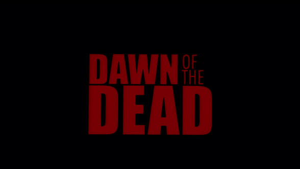
A successful OTS will use a specific typography to add to the tone and impression, this could be the font and colour of the text for example 'Dawn of The Dead' has big bold lettering to reflect the dramatic effect the film has and the red colour suggests horror and death again adding to tone and impression -

The use of a clever pun, making the type do what it says all adds to a successful OTS - Typography is important and shouldn't be an afterthought
.
Cooper also goes into detail on OTS having digital effects or live-action shots. He talks of liking the imperfection in hand made things. He mentions how within one of his OTS' he took a blowtorch to a glass covered photo and unintentionally the glass cracked over the girls eyes within it, This accident didn't ruin the opening title but infact added impact to the sequence and theres a certain beauty with things coming together naturally rather than starting from nothing and creating something completely digitally. All of this gave him a more successful and effective OTS.

Within this second clip Cooper speaks of 'The Dead Zone' which made a big impression on him. Its simple typography worked with the sequence and the music played out throughout the clip creating a mysterious atmosphere which again is key to a successful OTS. In this clip Cooper again speaks of Typography not being an afterthought but making sure it is clearly integrated into the OTS he likes the interesting use of contrast with type for example having dead set, horizontal type and rounded, moving background objects really works well. Focusing on how the two would go together is important and needed for a successful opening title sequence.
Kyle Cooper talks about different elements and uses of opening title sequence's. He starts by saying how a great title sequence almost shows a preview of the story that is about to come. It "dubs tales seamlessly" into the film. Also with it almost creating a starting atmosphere it sets the expectation for the audience, encapturing them into the film, building a certain level of unawareness to everything happening around them. Absorbing them in to the screen creating excitement for what's to come and setting the mood. Which is important for really getting the audience to pay attention from the offset. A successful OTS will ensure all of the audience is set on the film and only the film.
A successful OTS will use a specific typography to add to the tone and impression, this could be the font and colour of the text for example 'Dawn of The Dead' has big bold lettering to reflect the dramatic effect the film has and the red colour suggests horror and death again adding to tone and impression -

The use of a clever pun, making the type do what it says all adds to a successful OTS - Typography is important and shouldn't be an afterthought
.

Cooper also goes into detail on OTS having digital effects or live-action shots. He talks of liking the imperfection in hand made things. He mentions how within one of his OTS' he took a blowtorch to a glass covered photo and unintentionally the glass cracked over the girls eyes within it, This accident didn't ruin the opening title but infact added impact to the sequence and theres a certain beauty with things coming together naturally rather than starting from nothing and creating something completely digitally. All of this gave him a more successful and effective OTS.

Within this second clip Cooper speaks of 'The Dead Zone' which made a big impression on him. Its simple typography worked with the sequence and the music played out throughout the clip creating a mysterious atmosphere which again is key to a successful OTS. In this clip Cooper again speaks of Typography not being an afterthought but making sure it is clearly integrated into the OTS he likes the interesting use of contrast with type for example having dead set, horizontal type and rounded, moving background objects really works well. Focusing on how the two would go together is important and needed for a successful opening title sequence.

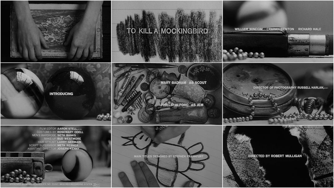
Kyle Cooper says some of his favourite title sequences "encapsulate the main characters obsession" For example in 'To Kill A Mockingbird' The whole OTS eerily shows one of the key characters obsession almost giving the audience an insight to what the character is going to be like again drawing them into the story.
Title Sequences are important because they better the audiences understanding of the film. You can almost use an opening title sequence as another scene. If the movie unfortunately doesnt have enough money left to shoot another scene because they may have left out key information it can be incorporated into the OTS like within 'Dawn Of The Dead' where key information on the "Zombie" outbreak and what is going on is fed directly to the audience - easing any confusion that may come later in the film. It is important that title designs help the movie and tell the back story if need be.
Excellent work - can this be moved down your posts now so it is next to all the other info on OTS (same place in blog as mine) as t sits strangely here - you are graded for the order of your posts and the sense of journey to your learning this gives.
ReplyDeleteREPLY